
The best org chart software: a comparison

.svg)
Org chart software represents the structure of an organisation: who reports to whom, who belongs to which team, who is accountable for what. In 2026, three families of tools answer that need. Drawing tools (Lucidchart, Canva) produce a clean image, frozen on the day it is made. HR systems (Lucca, Personio, Factorial) generate the reporting tree from HR data. Organisational-structure software (Talkspirit, Peerdom, Functionly, Organimi, Ingentis) keeps a live map of the organisation, with roles, accountabilities and decisions. This comparison reviews ten tools and proposes a selection grid for an organisation of 250 to 5,000 people.
For a long time, choosing org chart software meant choosing a drawing tool. You produced a tree, exported it as a PDF and dropped it into the welcome pack and the board file. Six months later it was wrong. One reorganisation, three hires, one acquisition, and nobody knew which version was the current one.
What we see across the organisations that use Talkspirit, more than 900 today, is that the question has changed. It is no longer “who reports to whom?”. It has become “who decides what?”. An org chart that answers the first question without answering the second does not solve the problem it is meant to solve: clarity.
What an org chart has to say in 2026
A useful org chart answers three questions, in increasing order of difficulty.
- Who reports to whom? This is the hierarchical question. Every tool answers it.
- Who is accountable for what? This is the question of roles and accountabilities. One position can carry several roles, and one role can be held by several people. Few tools can represent that.
- Who decides? This is the question of authority. Where a decision is taken, under which rule, and where it is recorded. Almost no drawing tool or HR system asks it.
The difference fits in one sentence. An org chart shows reporting lines. A role structure makes accountabilities, domains of authority and decisions visible, so that everyone knows who does what and who decides what. The first is presented. The second is practised.
Three families of org chart software
Before comparing tools one by one, you need to know which family you are looking in. The three families do not replace each other. They answer different needs, and many organisations combine two of them.
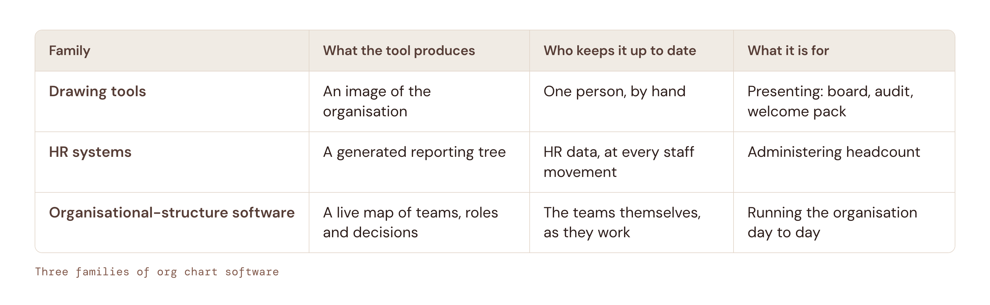
Drawing tools. An image of the organisation. Starting point: one person, by hand. Use: presenting (board, audit, welcome pack).
HR systems. A generated reporting tree. Starting point: hR data, at every staff movement. Use: administering headcount.
Organisational-structure software. A live map of teams, roles and decisions. Starting point: the teams themselves, as they work. Use: running the organisation day to day.
The comparison: ten org chart tools reviewed
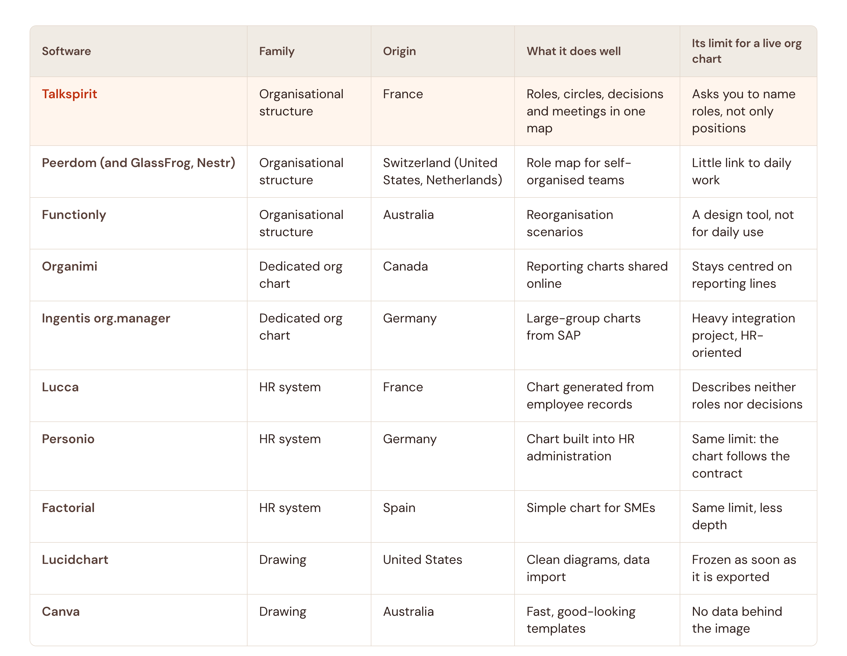
The list below summarises the ten tools selected. The sections that follow detail each one, with the profile of organisation it suits.
- Talkspirit (organisational structure, France): roles, circles, decisions and meetings in one map. Its limit: asks you to name roles, not only positions.
- Peerdom (and GlassFrog, Nestr) (organisational structure, Switzerland (United States, Netherlands)): role map for self-organised teams. Its limit: little link to daily work.
- Functionly (organisational structure, Australia): reorganisation scenarios. Its limit: a design tool, not for daily use.
- Organimi (dedicated org chart, Canada): reporting charts shared online. Its limit: stays centred on reporting lines.
- Ingentis org.manager (dedicated org chart, Germany): large-group charts from SAP. Its limit: heavy integration project, HR-oriented.
- Lucca (hR system, France): chart generated from employee records. Its limit: describes neither roles nor decisions.
- Personio (hR system, Germany): chart built into HR administration. Its limit: same limit: the chart follows the contract.
- Factorial (hR system, Spain): simple chart for SMEs. Its limit: same limit, less depth.
- Lucidchart (drawing, United States): clean diagrams, data import. Its limit: frozen as soon as it is exported.
- Canva (drawing, Australia): fast, good-looking templates. Its limit: no data behind the image.
1. Talkspirit: the dynamic org chart that says who decides
Talkspirit is the European operating system for organisational clarity. Its Structure module keeps a dynamic org chart: every team or circle, every role, every accountability, up to date in real time, because the teams themselves keep it alive as they take decisions.
Two views coexist. The radial view shows the circles and the roles they contain. The Hierarchy view displays a classic top-down tree, for whoever presents the organisation to a board, a new joiner or an auditor. In both, a click on a role opens its accountabilities, the person who holds it and the decisions that concern it.
The module adapts to the organisation’s governance model, from the classic hierarchical chart to role-based models such as Holacracy or sociocracy. Governance meetings, tensions and decisions are recorded in the same map. Goals, projects, documents and conversations attach to it, so the org chart is no longer a document beside the work: it becomes the frame in which the work is done.
An example of scale. At Groupe Morneau, a family-owned transport company of 1,300 employees across 24 terminals, the structure kept in Talkspirit holds 950 unique roles, 92 role templates and 75 circles, for 676 assigned employees, centralised in one shared reference.
Who it is for: organisations of 250 to 5,000 people, multi-site or multi-entity, that want the org chart to say who decides and not only who reports, with European hosting and ISO 27001 certification.
Its limit: Talkspirit asks you to name roles and accountabilities, not only positions. That is a clarification effort, and it is precisely what organisations come for.
2. Peerdom: the role map for self-organised teams
Peerdom, a Swiss vendor, offers a visual map of roles and circles, designed for organisations that practise self-organisation. The representation is clear and quick to pick up, and each person sees the roles they hold.
GlassFrog, the original Holacracy tool, and Nestr, a Dutch vendor for Holacracy and Sociocracy 3.0, cover the same ground with a map of circles and roles.
Who it is for: human-scale organisations, often purpose-led, that have already adopted a role-based model.
Its limit: the map stays a map. Meetings, decisions, goals and projects happen elsewhere, and the chart is only updated if someone goes back to it.
3. Functionly: designing the next organisation
Functionly, an Australian vendor, is an organisation design tool. It models reorganisation scenarios: redistributing functions, comparing two target structures, measuring each team’s load.
Who it is for: transformation directors and HR directors preparing a reorganisation.
Its limit: it is a design tool, used by a few people during a project. Once the new structure is decided, you still need a place where it lives every day.
4. Organimi: the shared reporting chart
Organimi, a Canadian vendor, is dedicated org chart software. It builds reporting charts from a data import, shares them online and enriches them with photos and profiles.
Who it is for: SMEs and mid-sized companies that want a clean online chart without deploying an HR system.
Its limit: the chart stays centred on reporting lines. Multiple roles, authority and decisions have no place in it.
5. Ingentis org.manager: the org chart of large groups
Ingentis org.manager, a German vendor, is widely installed in large groups of the German-speaking world for visualising complex structures from SAP or another HR system. Its orginio edition addresses smaller organisations.
Who it is for: groups of several thousand people whose structure is already described in the HR system and who want to visualise it in detail.
Its limit: the tool visualises what the HR system contains, that is, positions and reporting lines. It does not keep roles or decisions alive.
6. Lucca: the chart generated by the French HR system
Lucca, a French HR software vendor, generates the org chart from employee records. Every arrival, every departure, every change of manager updates the tree without intervention.
Who it is for: French organisations already equipped with Lucca, for whom the reporting chart is enough.
Its limit: the chart follows the employment contract. It describes positions and reporting lines, never roles, accountabilities or decisions.
7. Personio: the chart built into HR administration
Personio, a German vendor, builds the org chart into a complete HR administration, widely used by mid-sized companies in Germany, Austria and Switzerland.
Who it is for: mid-sized companies in the German-speaking world that centralise their HR administration in Personio.
Its limit: the same as any HR system. The chart is a by-product of administrative data, not a map of the organisation as it actually runs.
8. Factorial: the simple chart for SMEs
Factorial, a Spanish vendor, offers an org chart generated from its HR system, with a quick learning curve.
Who it is for: SMEs that want a correct chart with no effort, inside a general-purpose HR tool.
Its limit: less depth than Lucca or Personio, and the same absence of roles and decisions.
9. Lucidchart: the clean diagram
Lucidchart, a US vendor, is a diagramming tool. It produces neat org charts, imports a list of employees from a spreadsheet and is easy to share. Microsoft Visio and draw.io occupy the same ground.
Who it is for: anyone who has to produce a presentable chart for a meeting or a document, with no database behind it.
Its limit: the diagram is frozen as soon as it is exported. Someone has to reopen it, and that person is never the one who changed position.
10. Canva: the quick template
Canva, an Australian vendor, offers org chart templates that are easy to customise. The result looks good and is ready in minutes.
Who it is for: a small structure, an association, a one-off need.
Its limit: there is no data behind the image. It is an illustration, not a source of truth.
How to choose: six criteria
The right org chart software is the one that matches the question you are asking. Six criteria settle it.
- The source of truth. Who updates the chart, and on what occasion? If the answer is “one person, when they think of it”, the chart will be wrong in six months. If the answer is “the teams, when they decide”, it will stay right.
- Roles, not only positions. One person can hold several roles, and a role can be shared. If the tool accepts only one reporting line per person, it will represent yesterday’s organisation.
- Decisions. Does the chart say where a decision is taken and where it is recorded? This is the criterion that separates a presentation chart from a working instrument.
- The governance model. Does the tool impose a method, or does it adapt to yours, whether hierarchical, role-based or hybrid? A mid-sized company in transformation needs both at once, often in the same map.
- Daily use. Is the chart connected to meetings, goals, projects and documents? A chart consulted once a quarter changes nothing. A chart opened every day becomes the frame of the work.
- Hosting and compliance. For a European organisation, data location, GDPR and a certification such as ISO 27001 are not a detail. They are purchase criteria.
A simple way to read these criteria: the first two say whether the chart will be right, the next two whether it will be useful, the last two whether the CIO and the legal team will accept it.
What we have learnt from more than 900 organisations
Organisations that keep a live org chart do not do it out of a taste for cartography. They do it because the cost of ambiguity is paid every day: meetings that decide nothing, projects without an owner, new joiners who take three months to work out whom to ask.
The move from a frozen chart to a live structure almost always follows the same path. You start by naming roles where they are blurred. You make decisions visible where they are taken. You connect meetings and goals to the structure. And the org chart stops being a document you present and becomes the place where the organisation understands itself.
That is the conviction that guides Talkspirit: Performance Starts With Clarity.
Not a tool. Your Organisation’s Operating System.
FAQ
Mapping an organisation’s structure means recording three things: who reports to whom, who is accountable for what and who decides what. A drawing tool or an HR system covers the first. Organisational-structure software such as Talkspirit, Peerdom or Functionly covers all three, and keeps the map alive because the teams update it themselves as they decide.
An org chart shows reporting lines. A role structure makes accountabilities, domains of authority and decisions visible, so that everyone knows who does what and who decides what. The same person can hold several roles, which a classic org chart cannot represent.
An HR system is enough if the reporting chart is all you need. It generates the tree of reporting lines from contracts and updates it at every staff movement. It describes neither roles, nor accountabilities, nor decisions, which are precisely what most organisations in transformation lack.
Yes. A dynamic org chart does not impose a governance model. In Talkspirit, the Hierarchy view displays the classic top-down tree, and the module adapts to your method, from traditional hierarchy to role-based models. You choose the mode, the rules and the terminology, and you evolve them at your own pace.
An org chart stays up to date when updating it is not a separate task. Three conditions help: a single source of truth rather than several files, teams that edit their own part of the map, and a chart connected to daily work, so that a decision taken in a meeting is reflected in the structure without re-entry.